
Lab Reports

My Role
Lead Designer — UX Research, Interaction Design, Visual Design, Prototyping
Collaboration
2 Product Managers
3 Front-end Engineers
1 Back-end Engineer
Timeline & Status
10 months (on and off), launched in March 2023
Project Overview
Lab reports are documents providing detailed lab data of a patient, which doctors use to inform medical plans and decisions. Our goal was to provide a seamless experience that would incentivize doctors to switch from the legacy EHR to our new cloud-based solution.
I owned the end-to-end design, from discovering opportunities through user research to prototyping an all-in-one feature set that enhances doctors' efficient and effective use of lab data.
The feature usage has been steadily growing. Moreover, we received a lot of positive feedback from doctors, with "fast transcribing" and "easy access to trend charts" being rated as the top two most helpful features among the xHIS features by 16 out of 32 doctors.
Context
Reinvent for the better
ASUS xHIS is a new cloud-based Electronic Healthcare Records (EHR) system for outpatient service aiming to assist hospitals in transitioning from a decades-old EHR system to a new system that enables delivering better care.
One of the features that doctors use on a daily basis in EHR is Lab Reports. With patients' lab results, doctors are able to make disease diagnoses, inform care or treatment decisions, and evaluate the effectiveness of treatment.
My task was to explore what we can do better than the old system and help doctors achieve their goals through better design. Our goal was to deliver a feature that would encourage users to transfer to xHIS and stay.
To ensure a seamless integration and validate the product, we collaborated with a local hospital and their healthcare professionals to develop xHIS. We also assisted them in migrating to our new system.
user research
Unveiling the Unknown: The complexity of the feature and user’s diverse information needs
In the early phase of the project, I conducted interviews with 4 doctors to talk through how they use Lab Reports currently to get a sense of their work and what they’re trying to achieve. The followings are what we learned:
Doctors use 3 report formats across systems to evaluate patient health
Besides the basic individual report, doctors also use two more formats located in Rounding System to track a patient's health. This information has also prompted us to reevaluate the complexity and roadmap for the feature.


Use cases and needs are varied
Doctors often have different workflows and needs that should be taken into consideration. Some doctors prefer to review reports at the beginning of each patient encounter, while others review them only when necessary. Additionally, their information requirements may vary depending on the patient's symptoms or diseases. For instance, cardiologists often rely on trend charts and cumulative reports to monitor a patient's progress with diabetes, whereas orthopedists typically do not require these tools. The timing of the need for lab results may also differ during a patient encounter.
The time and attention doctors couldn’t spend on their patients
During a 3.5 hours clinical session, a doctor may have around 50 or more patients. To maximize time spent with each patient and finish on time, it is essential for doctors to operate the EHR system efficiently.
Unfortunately, the design of the old system and its limited capabilities resulted in doctors spending more time and effort navigating the system, searching for reports, and transcribing results, rather than focusing on patients.

Based on the research, I mapped out the workflow that shows how doctors use laboratory reports to help us identify the friction. (polished and translated version)

1 / 2

The problem
Doctors’ work efficiency was being held back
Through our research, we have identified the following major pain points experienced by doctors. We believe that these challenges can be turned into opportunities for us to win more users.
Reports were fragmented.


Lack of ways to find a specific record quickly.
Lab reports often involve complex and large datasets, especially when dealing with patients who have long-term and complex health conditions. However, without sufficient tools to trim down displayed items, doctors tend to spend more time on searching.
Design and process were error-prone.
The design of trend charts is unclear and misleading, requiring doctors to pay extra attention. In addition, doctors often manually transcribe lab results to progress notes, which could lead to errors and inefficiency. Being able to transcribe results automatically was also many doctor’s long-held wish.
Define
Gathering inputs and aligning with the team
As mentioned, through the research, we realized that the feature was more complex than expected. With the goal to deliver this feature in the first launch of xHIS, our team sat down together to reevaluate launch plan, discuss the implementation details (i.e. the feasibility of altering report aggregation methods), and identify the emerging challenges. It helped us align on what we both wanted and could achieve for the first launch of the project.
Some early exploration I shared with the team to discuss and gain buy-in for the ideas of changing ways of aggregation reports.
Constrains and Challenges
Limited development time
Our goal was to release the feature in a soft launch in December 2022 to gather user feedback. However, there is still a lot of work that needs to be done. Thus, it was crucial to collaborate with engineers to gain a better understanding of the feasibility and estimated implementation time of the development. This ensures that we can deliver the feature on time.
Challenges with complex and unstructured data
The lab report datasets are complex, large, and not well-structured due to legacy data management. Without a complete understanding of the data structure, types, meaning to users, and possible corner cases, it could lead to a design with poor usability. So I worked closely with the engineers, hospital IT, and doctors to better understand the data and implementation details.
The Scope
As a team, we were well aware of the challenges of convincing users to switch from their old systems to the new one (and stay). We understood that doctors had been struggling with the low efficiency of the old system for years. This understanding led us to believe that by offering a seamless experience and the right tools to improve their efficiency, we could create great delight for our users and encourage them to stay. Thus, we decided on the following MVPs to launch:
Design
Introduce “Views” experience to Lab Reports
The decision to determine the way of displaying reports first was made to enable me to design for specific screen sizes and explore navigation within those constraints more effectively.
Views is an interaction already implemented in other report features of xHIS. It can accommodate users' varied use cases and create a consistent experience across features. With Compact View, doctors can effortlessly cross-reference reports with progress notes to transcribe lab results and understand the patient's health. And with Full View, they are also given a distraction-free environment to dive deep into the reports.


As we’re on a mission to boost doctor’s work efficiency by integrating three report formats and reorganizing reports, one of the main challenges was finding a balance between giving access to lots of content and keeping a clean, easy-to-use interface.
Top navigation
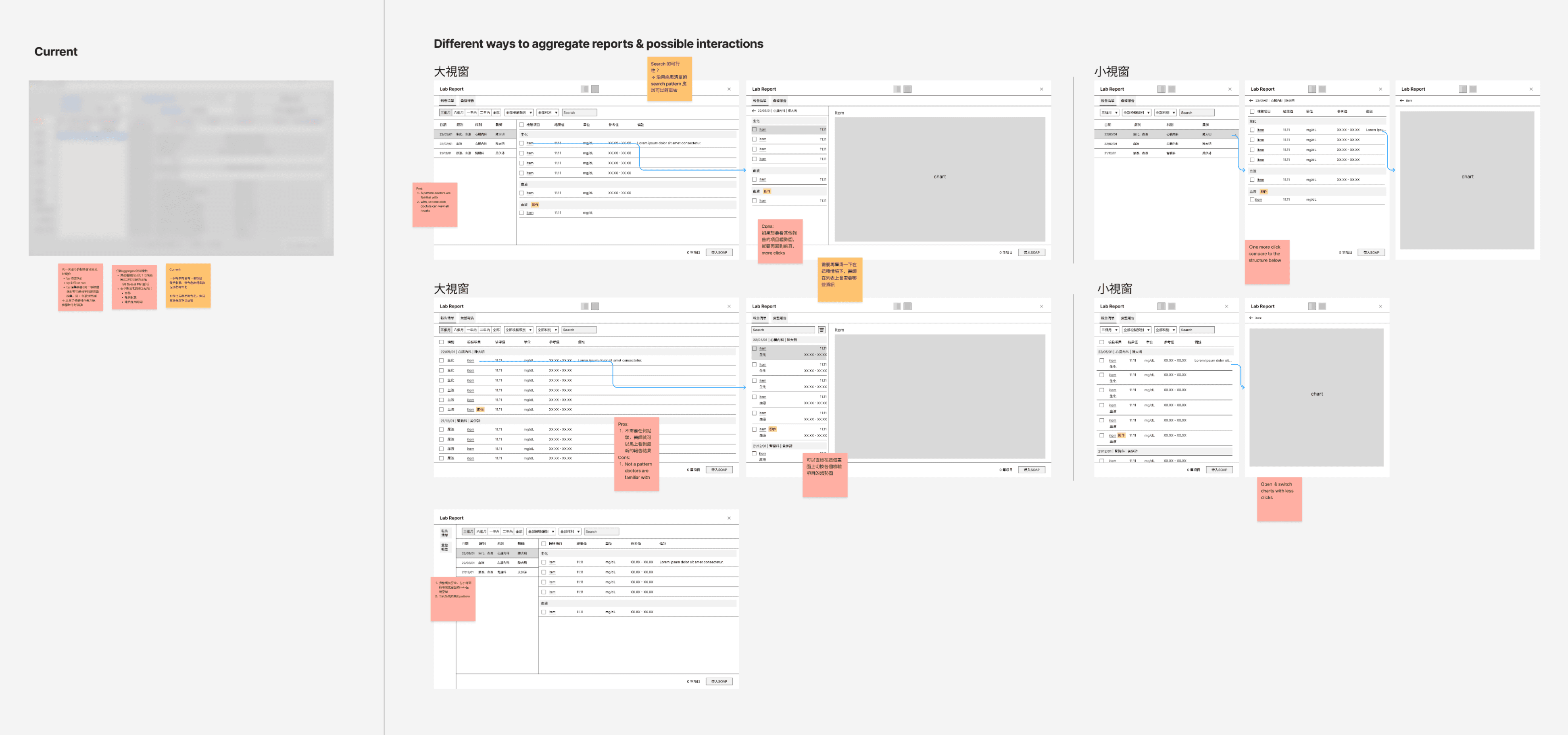
To better manage complexity, my initial approach was to use Individual and Cumulative Reports as the primary navigation, each with their own sub-navigations for easy access to specific reports. Although this structure was quite intuitive to doctors, some doctors desired faster access to each cumulative report — by putting every cumulative report in tabs. This way, they could scan through Individual Reports while quickly switching to the Cumulative Report for in-depth reading and analysis.


After carefully considering the pros and cons of the doctor's proposal, including its usability and scalability, I ended up adopting the solution. It only takes one click to open the cumulative report and improves the visibility and discoverability of the feature, which later we found does allow more doctors to discover this feature they've never noticed before.
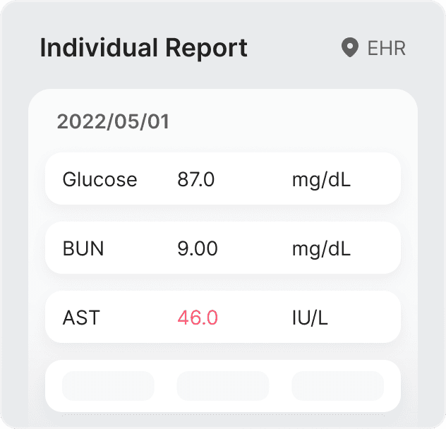
The individual report layout
The individual report layouts determine how users will navigate among new structured reports. Striking a balance between clear navigation, efficiency, ease of reading, and clean interfaces was a significant challenge, particularly within the limited real-estate of Compact View.
As tackling this challenge, I played around with various ways to structure reports and interactions. I eventually settled down with two designs to choose from:

1 / 2
In our pursuit of efficiency, we landed on a two-level structure design that is optimized for users to read and take actions across reports. However, after launching to more users, we received feedback that 5 out of 49 doctors are still not used to the new lab report design and stick to the old system. Although they appreciate the efficiency brought by the new design, they have found that the hierarchy does not align with their expectations.

To mitigate user’s change resistance, we iterated on the design to make the interaction and layout more close to the old system, while maintaining the continuity and efficiency initially given.


Why are the test results aligned to the left rather than the right in table cells?
A more accurate trend chart with faster access
Opening trend chart is faster than ever. Users now can access trend charts with just a click in a second. We also introduced interactive charts, empowering users to explore data points on their terms. The enhancements in visualization accuracy enable doctors to have better-informed conversations with their patients.

Open the trend chart with just a click.
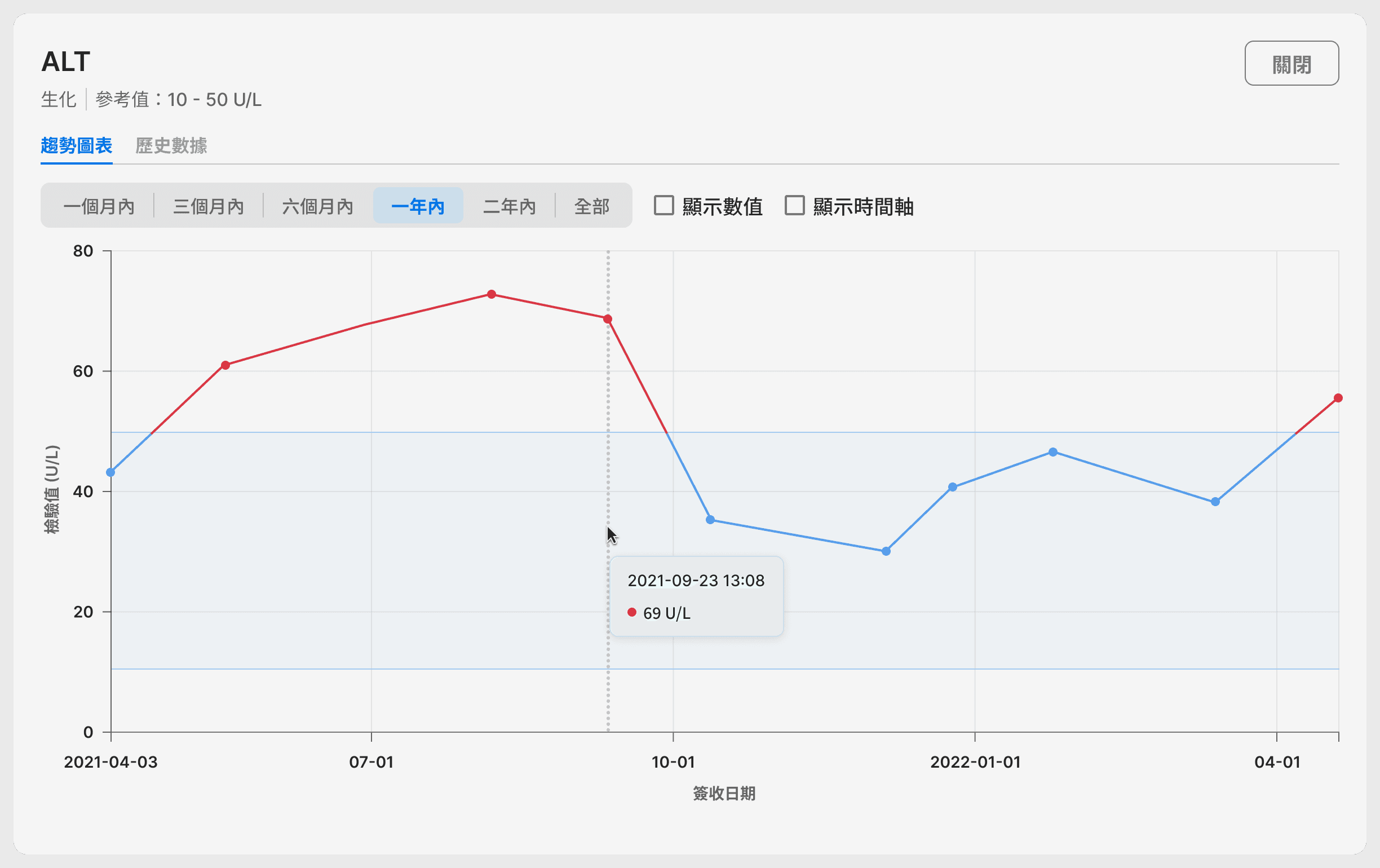
The tooltip shows on hover to reveal more detailed information.
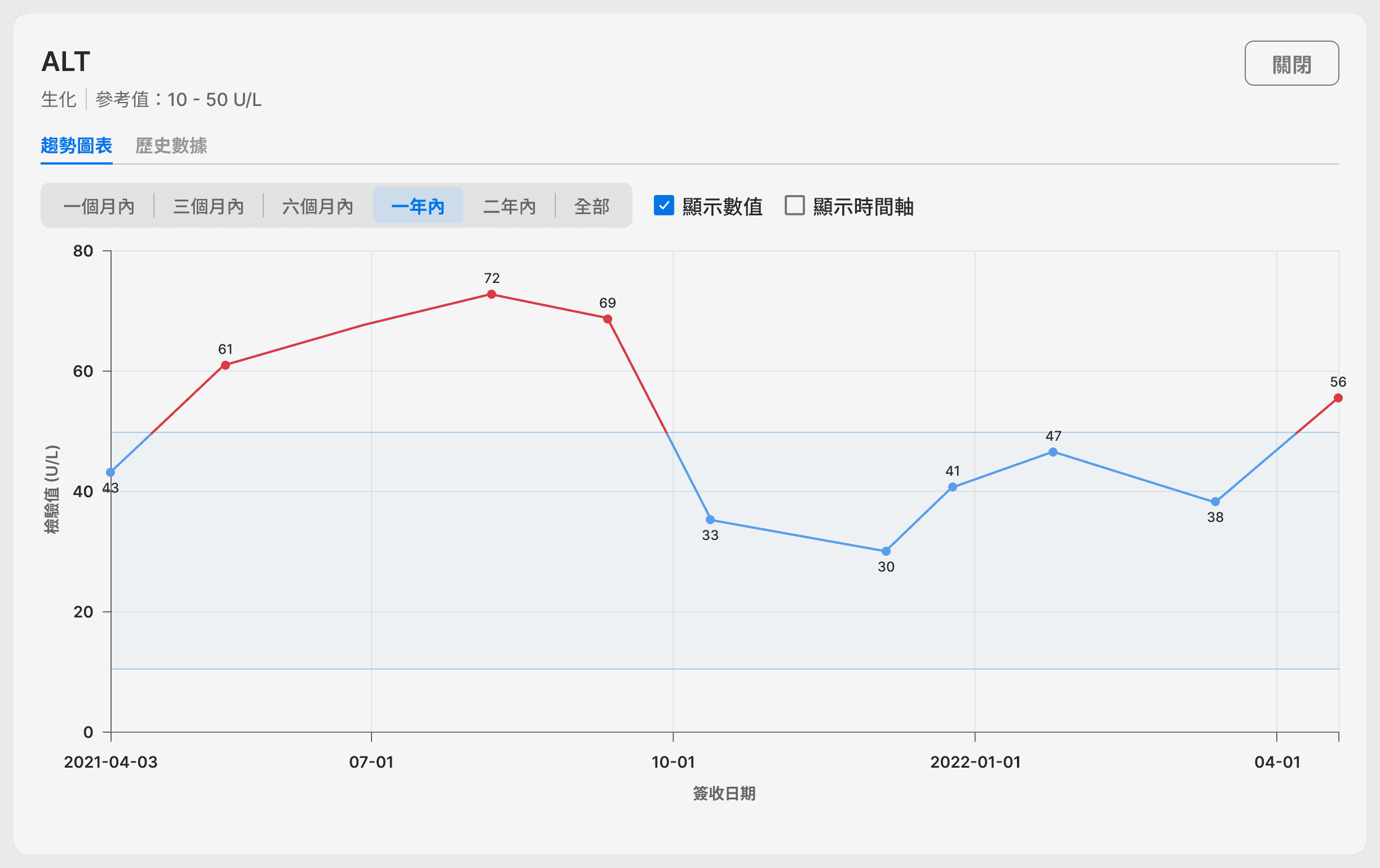
Users can choose showing the value of the data point or not.
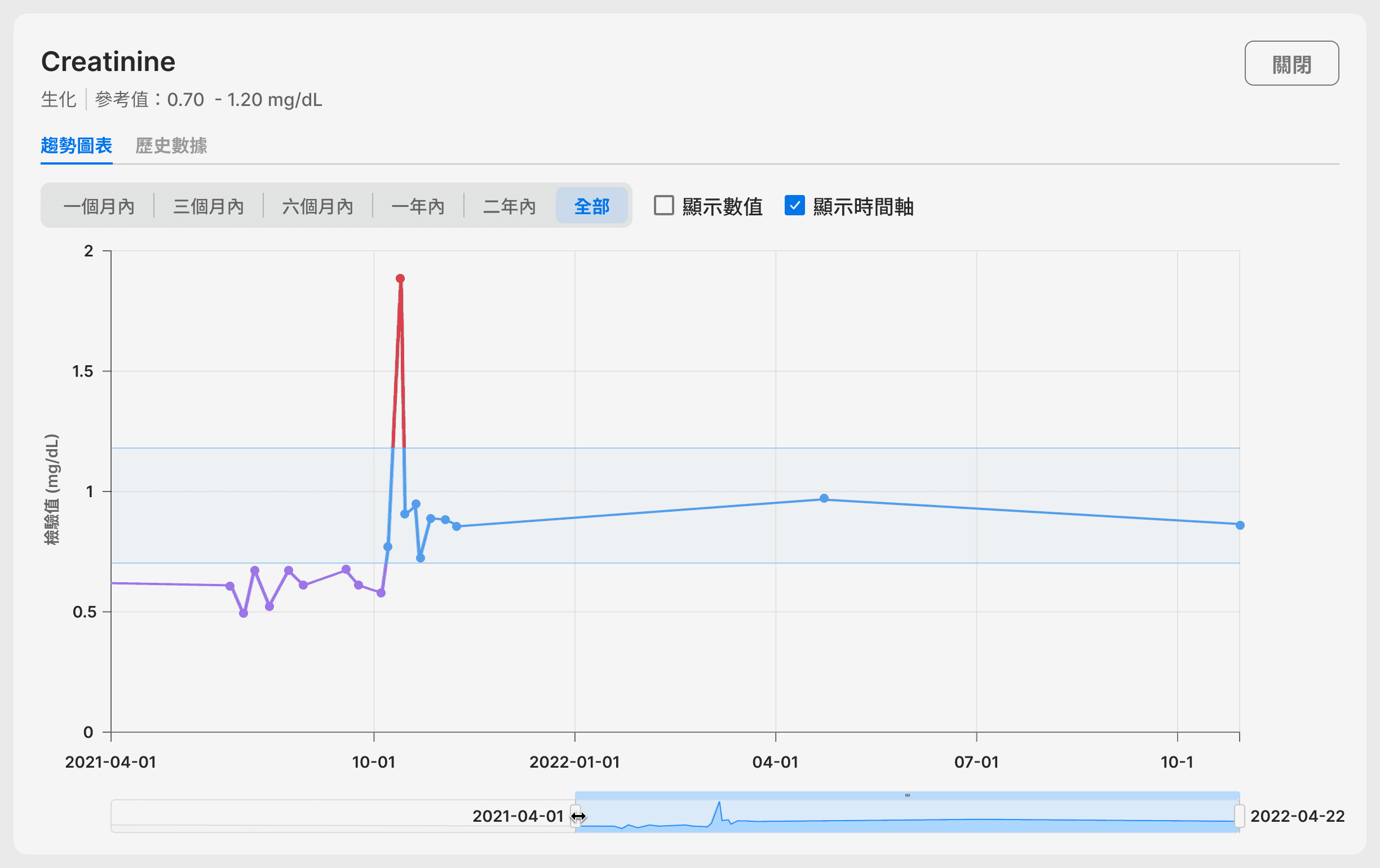
The Data Zoom Slider enables users to examine a smaller range of data. It is particularly useful when data points are dense and difficult to read. It also help users get rid of outlier points.
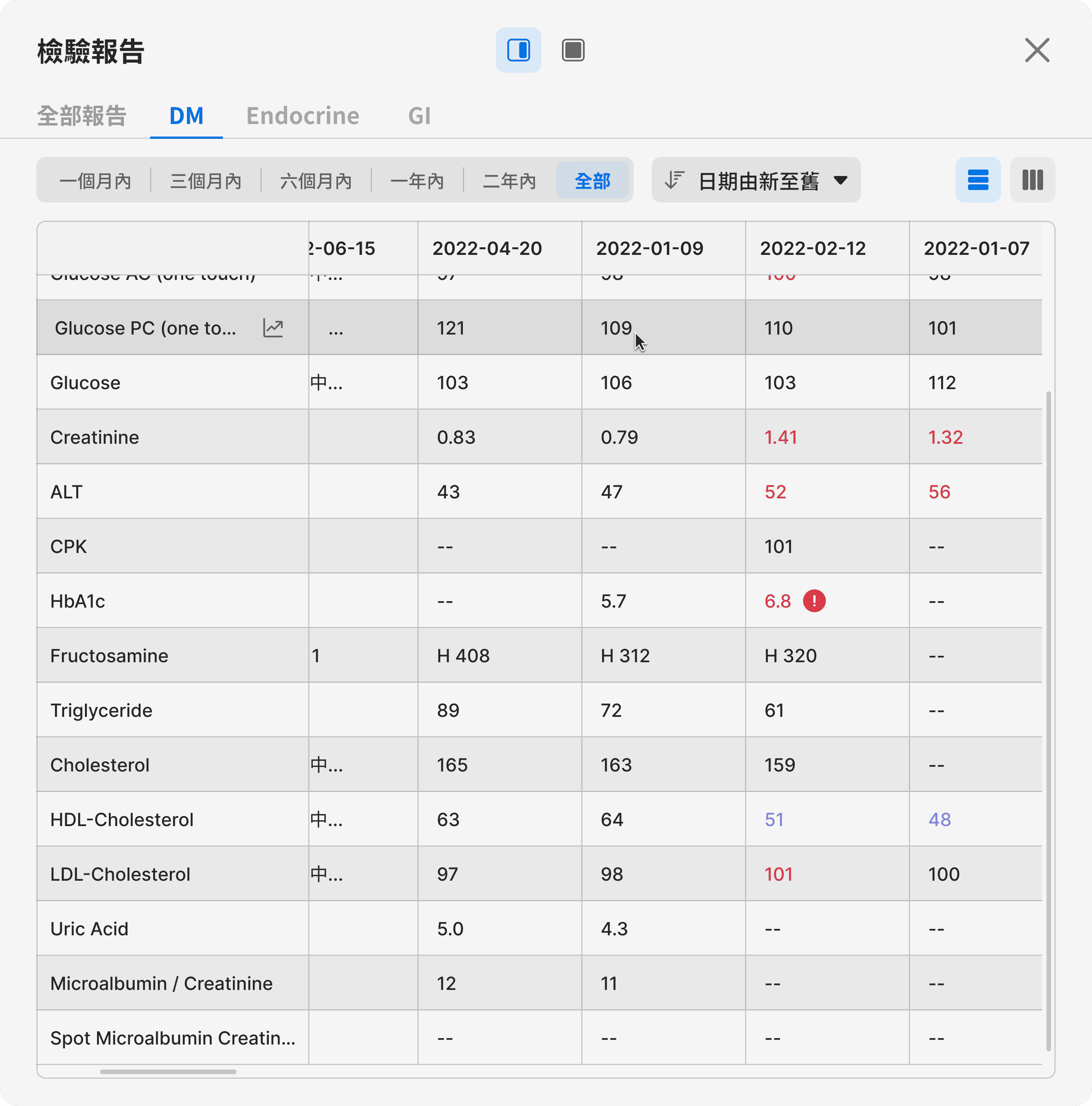
Cumulative Reports
Cumulative reports are used to track changes in a set of lab results related to a specific disease over time. They assist doctors in monitoring the progress of the disease. I used row stripes to make the rows easier to scan and read. Additionally, an access to trend chart was added so that users can view charts in the context without having to jump back to individual reports.

On scroll, the row and column headers remain fixed. This allows users to track and maintain context across wide and extensive data sets.
Transcribing results made easier and error-free
Say goodbye to error-prone methods of transcribing. Users can now select the lab results and simply copy and paste them into the progress notes, without the worry of entering incorrect numbers. Also, with the Compact View, users can easily cross-reference while transcribing.
Copy & Paste or Direct Insert?
In the early exploration, I considered inserting the results directly into progress notes as an efficient way for transcribing results. However, I soon discovered that doctors put results in the different places in the progress notes. Direct insert would actually be inconvenient. Eventually, I landed on the Copy & Paste interaction, allowing doctors to place the lab results wherever they prefer within the progress notes. It also gives them more sense of controls.

Outcome
The growth is steadily moving forward.
Released on
By September 2023, the feature has been used by
In training sessions,
16 out of 32 doctors rated 'fast transcribing' and 'quick access to trend chart' as the top two most helpful features among the xHIS features.
*We only released the xHIS to 1-2 doctors in some divisions to receive user feedback and test.
The journey never ends
We got many valuable feedback from our users regarding what they really like, what we can improve, and what they desire to have next. It prompted us to create a more intuitive navigation, make filters more efficient to use, a customizable cumulative report, and more.
In August 2023, the team also set out setting up more comprehensive event parameters in lab reports to measure the success and guide future decision-making.
The work to create a more efficient Lab Report may far from finish as the team aims to reach to more users and hospitals. There’s still much to do, but we are excited that our first step brings better efficiency and pleasant experience to our users. The team is ready to continually learning from our users and delivering even more delightful experiences in their work.
Takeaways
Always understand the data you’re designing for
Before diving into the design phase, it is important to spend time with engineers and users to understand the characteristics of the data. This includes understanding the data types, the relationships between the data, and their meaning to users. Having a deep understanding of the data will not only inform better design decisions, but also ensure us communicate the data accurately.
Overcoming Change Resistance in Legacy Systems
When designing for doctors who have used a legacy system for almost 30 years, one of the biggest barrier is users’ change resistance. To resolve this, it is essential to identify the dealbreaker — what users value and what can motivate them to adopt the new one, as well as the roadblock— what stop them from adaption.
In our context, we have observed that doctors highly value their time and are unwilling to invest too much time in learning a new system. Though they’re okay with the current system, they are not happy with it.
Thus, when designing the new EHR, it’s not about creating pretty UI or fancy functionalities. It’s about finding the commonalities between the existing system and new opportunities that not only allow users to pick up quickly, but also truly ease their current pain.
Lastly, don’t leave users on their own. From our observation, users prone to ditch new system easily when frictions happen. By providing them with proper training and allowing them time to adapt, we can significantly reduce their resistance.